Loot
SCROLL
Timeline
Aug 17-Sept 20
7 weeks
Role
Content Manager
UX Research
Ilustrator
UX UI Designer
Industry
Creative Agency
Marketing
Team
4 UX UI Designers
About The Project
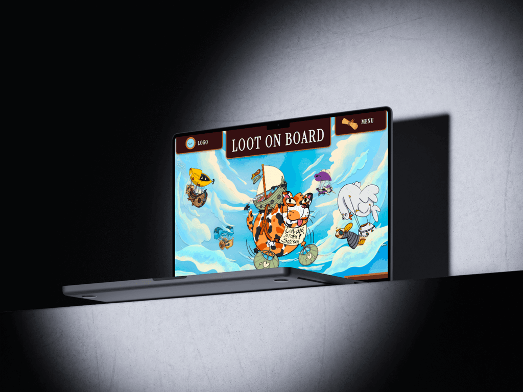
“LOOT on Board” is an online card game inspired by the renown game inventor Reiner Knizia’s “The Plundering Pirate Card Game”, a highly clever card game that is at once simple to learn and fast to play, while engaging those looking for strategic challenges.
LOOT on Board was created by a group of students, wanting to put their skills to the test and to challenge themselves by creating an online cat version of the original game.
Creating an Engaging Online Card Game Experience
Our research revealed that many online card games fail to replicate the fun of in-person play, often suffering from slow load times and confusing interfaces that detract from the overall experience. This insight posed a challenge: to design an online game that captures the excitement and interactivity of the original "Loot," while also introducing innovative elements like new themes and characters.
With this goal in mind, we aimed to develop an engaging online version that feels just as enjoyable as the physical game. Key challenges to address included:
How can we enhance player interaction?
What strategies can we implement to attract players?
How can we assist players in learning the game effectively?
What features can we introduce to replicate the in-person enjoyment?
By tackling these questions, we hope to create an online card game that not only retains the essence of the original but also elevates the digital experience for players.
Upon conducting product research we, the UX UI designers, found the key followings as base for our design:
Competitor Analysis
Clear action history and distinctive UI design are essential for users.
Tutorials must be simple, as complex instructions quickly lose user interest.
Player Reviews
The game is seen as a casual filler for 3-5 players.
Players find the game difficult to learn.
Focus concept of the game is appealing to both strategy and casual players
Market Research
Online card players range from 25 years and older.
Competitive strategy games are preferred, especially by male players.
Male gamers favor computer while female players prefer casual games on consoles.
Defining User Personas and Evolving the Game Concept
After identifying our primary target audience, we developed two user personas representing both casual players and dedicated board game enthusiasts. This groundwork allowed us to create a user journey and structural framework for our design.
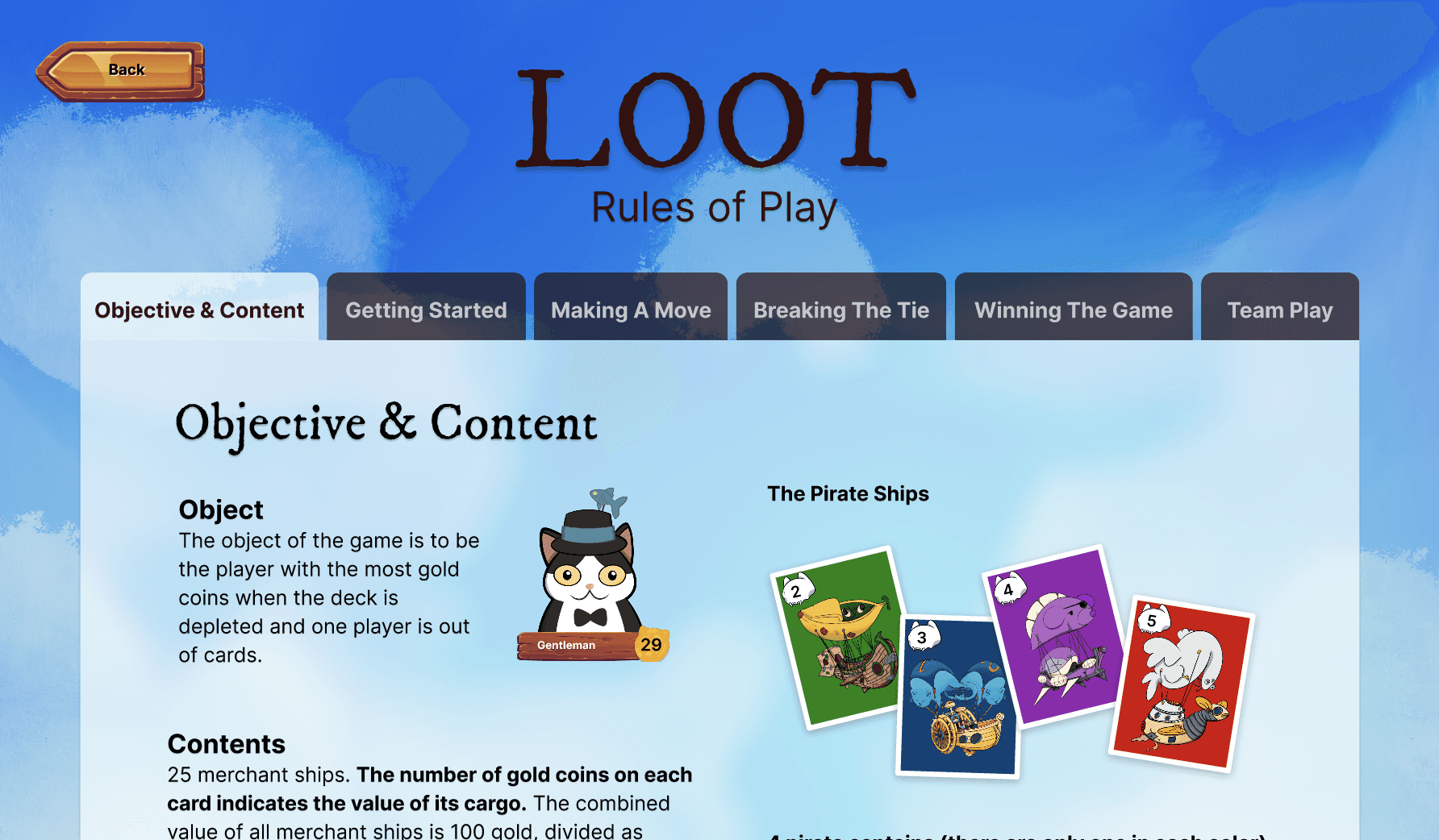
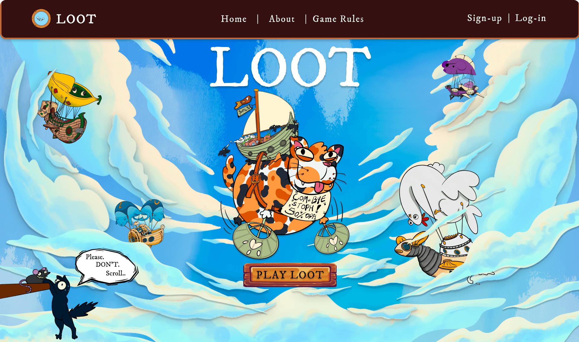
Our research indicated that board and card game lovers are increasingly drawn to whimsical, silly, or captivating illustrations. Recognizing that "Loot" was becoming outdated and garnering less attention, we decided to revitalize the game's concept by reimagining it as a whimsical adventure featuring cat pirates in the sky. This new theme aims to engage players with its playful and intriguing visuals, aligning with the current interests of our audience.
Cat Pirate Design - by Marcela Valencia
Pirate Ship Design - by Kyra Magdaluyo (me)
Wireframing the Game Design
With the illustrations for our new concept finalized, we moved forward with drafting various wireframes for the game. This stage allowed us to explore different layouts and interactions, ensuring a seamless user experience that aligns with our vision for the cat pirates in the sky theme.
User Testing for Iterative Improvement
We conducted two rounds of user testing. The first round focused on evaluating the initial draft of the game, while the second round assessed the updated version, which incorporated user feedback and addressed their concerns. This iterative process allowed us to enhance the gameplay experience and ensure it resonated with our target audience.
Innovative Engagement Strategy: Encouraging Scrolling
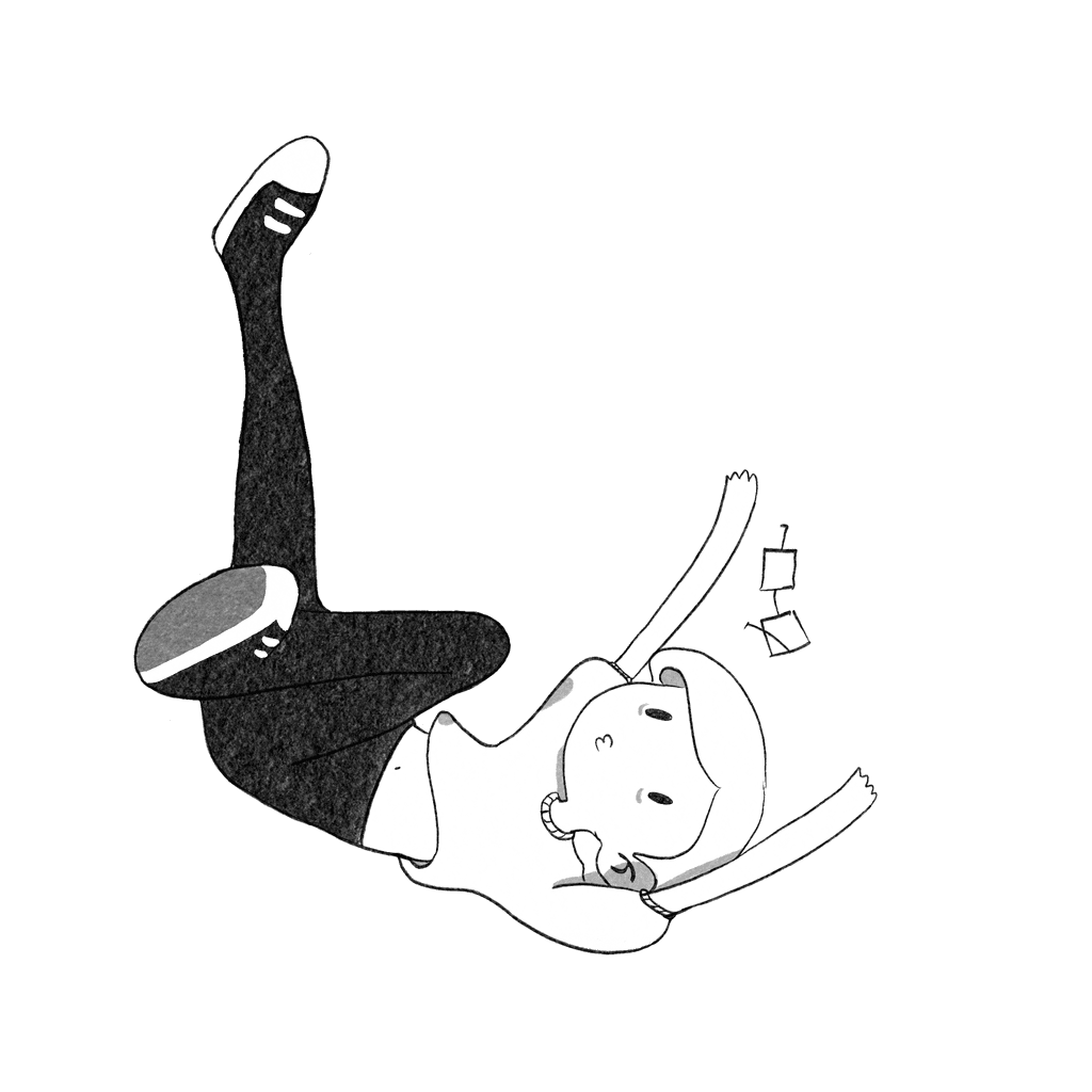
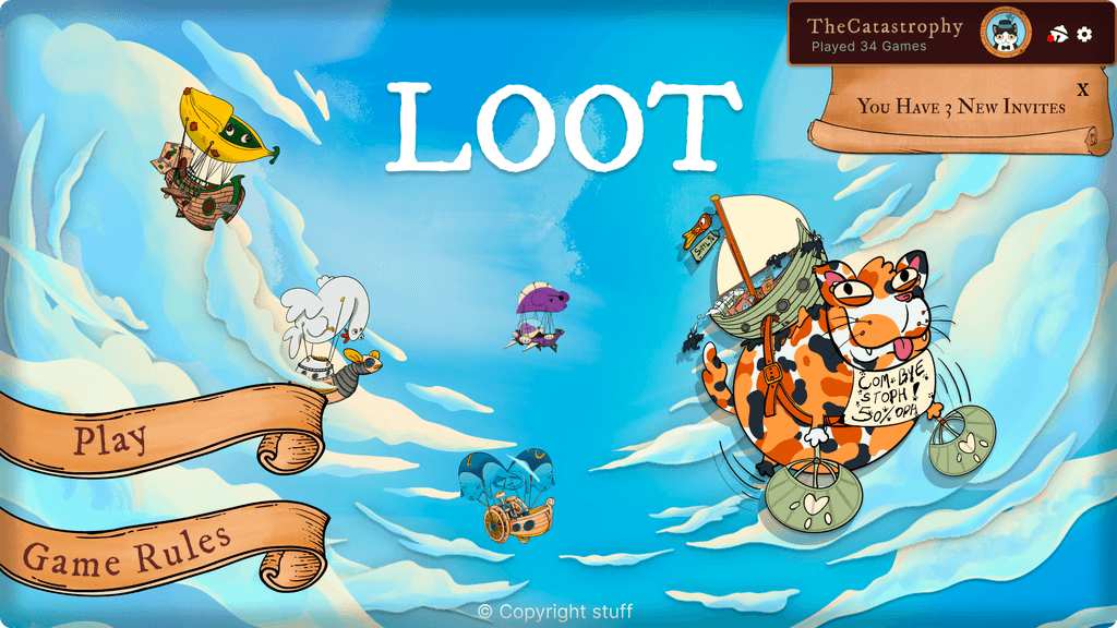
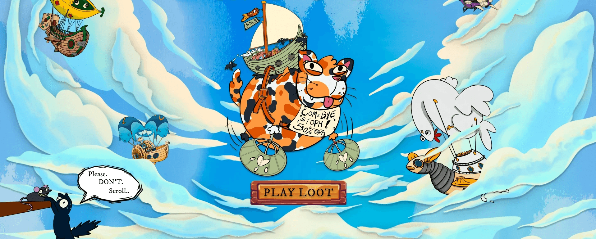
Our research revealed that users often do not scroll on websites. To address this challenge, I drew inspiration from marketing strategies that utilize reverse psychology to encourage engagement. I illustrated a cat precariously hanging from the corner of the screen, playfully urging users "not to scroll." This creative approach effectively captured users' attention, making them more entertained and inclined to scroll past the hero section, ultimately enhancing navigation through the landing page.
Enhancing User Interaction: Emotions and Avatars
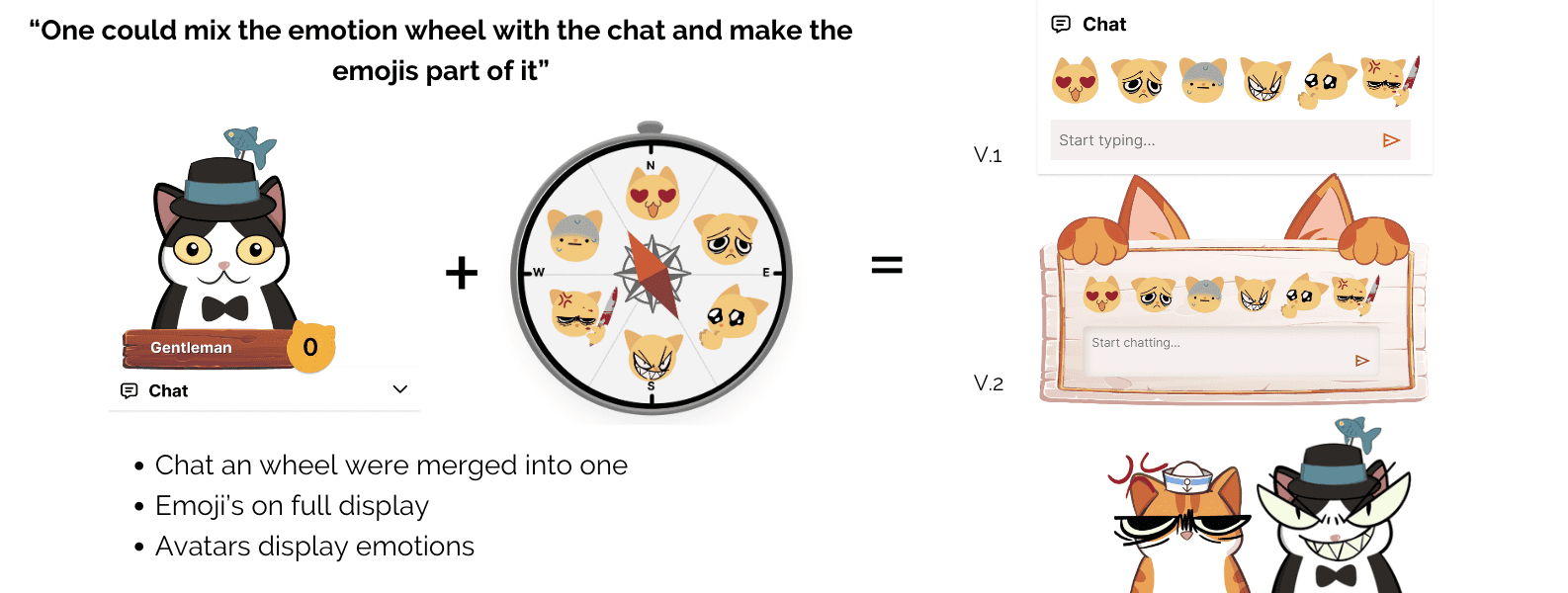
Users often struggled to understand the functions of each card, prompting us to introduce an emotion wheel inspired by FigJam's sticker wheel. This aimed to foster interactions between players. However, feedback revealed that users were not as enthusiastic about the wheel as we had hoped, leading us to shift the illustrated emoticons to the chat section of the screen.
Despite this change, our research indicated that users rarely engaged with the chat during gameplay and did not respond positively to simple pop-up emotions appearing beside characters. To address this, we implemented a solution where user avatars would emit selected emotions directly on the screen. I created illustrations to enhance this feature and improve the overall user experience. After testing this updated interaction model, users reported significantly higher satisfaction and enjoyment from the engaging, interactive changes made to the game.
Improving Clarity in Tutorials and Instructions
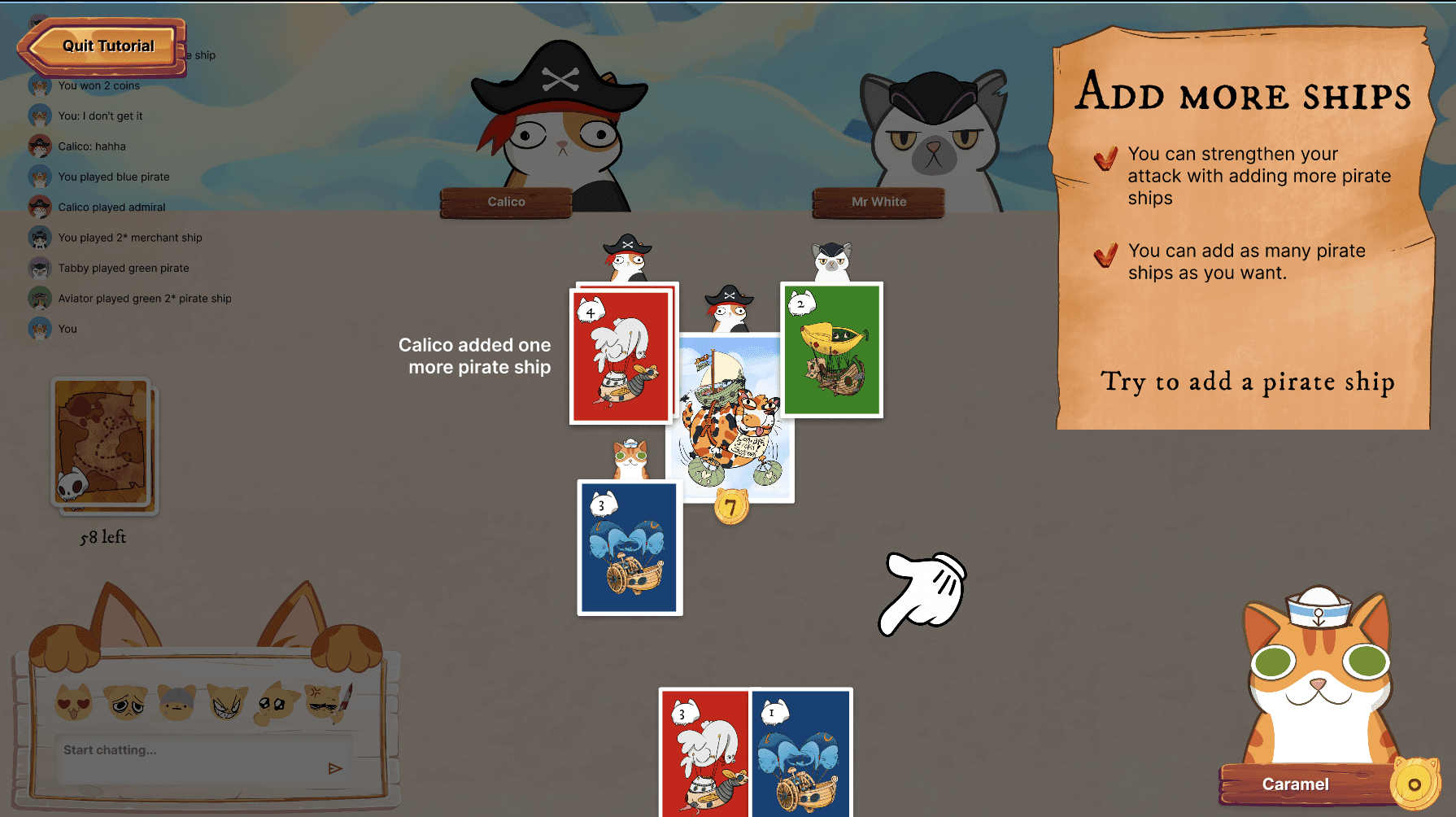
Initially, the game featured pop-up instructions that accompanied users throughout gameplay. However, many players expressed confusion regarding the specific elements referenced in the tutorial. To address this issue, we consolidated the tutorial into a dedicated section of the screen, highlighting areas not being discussed during the walkthrough.
This strategic change proved effective, as users found it easier to focus on the key aspects of the game during the tutorial. As a result, they gained a clearer understanding of the game flow, significantly enhancing their overall experience.
Rethinking User Interaction: The Emotion Wheel Experience
Our emotion wheel, inspired by FigJam's sticker wheel, was designed to enhance interactions between users during gameplay. However, user feedback indicated that it did not meet our expectations in terms of appeal and utility. As a result, we pivoted to shift our illustrated emoticons into the chat section of the screen.
Despite this adjustment, research revealed that users rarely engaged with the chat during gameplay and showed little enthusiasm for simple pop-up emotions appearing beside characters. To address this, we developed a solution where user avatars would emit emotions based on the users' selections. I created illustrations to enhance this feature and enrich the user experience.
After testing this updated interaction model, we observed a significant increase in user satisfaction and enjoyment. The new approach to expressing emotions proved to be more engaging and entertaining, fostering a more interactive gameplay environment.
Enhancing User Experience: Streamlining the Board Game Layout
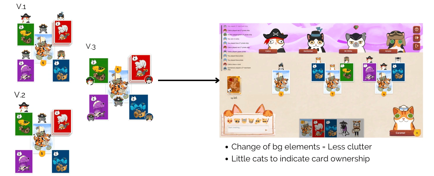
User feedback indicated that the first draft of the game screen felt crowded and overwhelming. In response, we undertook a redesign to simplify the layout of the board game. We developed three alternative styles and conducted tests to determine user preferences.
Based on user feedback, we identified a favored style, which we then implemented in the board game design. Additionally, we hypothesized potential issues and solutions to address any remaining user concerns, ensuring a more intuitive and enjoyable gameplay experience.
Improving Turn Indicators: Enhancing Gameplay Clarity
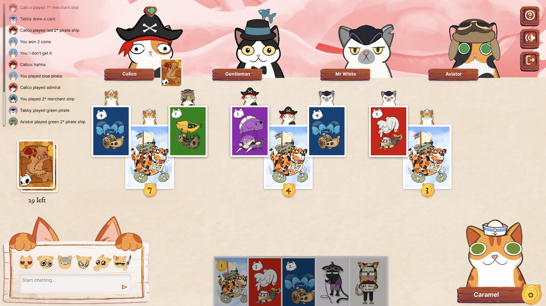
Users experienced challenges in identifying whose turn it was during gameplay, leading to confusion and disengagement. To address this issue, we introduced a hovering arrow that clearly indicated the active player's turn and incorporated background changes as the game progressed.
These subtle enhancements greatly improved accessibility and clarity for users, ensuring a smoother and more engaging gameplay experience.
