SCROLL
Timeline
February 2023
3 Weeks
Role
UX UI Designer
UX Researcher
User Testing
Industry
Beauty Industry
Team
4 UX UI Designers
About The Project
CB Beauty is dedicated to enhancing natural beauty and empowering individuals through the art of makeup. CEO and owner Carla Beatriz is a Brazilian make up artist who specialized in bridal makeup, special occasion makeups, and editorial and photographic makeup. Carla also provided makeup classes and wanted a professional platform for her clients to browse her work, services, and book appointments.
Enhancing Brand Identity and Audience Engagement for CB Beauty
Background
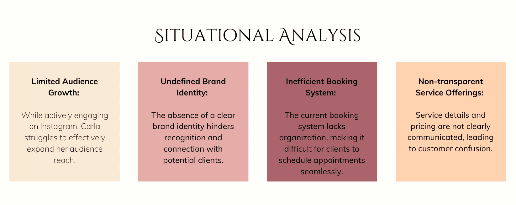
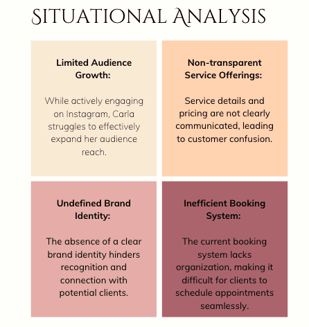
Carla Beatriz, a talented makeup artist originally from Brazil, operates her brand, CB Beauty, in Vancouver. Despite her expertise and active presence on Instagram, Carla faces significant challenges in expanding her audience and establishing a strong brand identity.
Impact on Business
Customer Confusion: The lack of clarity in service offerings and pricing results in missed opportunities for bookings.
Reduced Interest: Insufficient self-introduction and details about services diminish potential clients' interest.
Hindered Growth: The absence of transparent pricing and client testimonials limits trust and further growth.
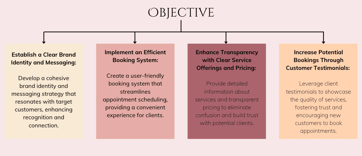
Showcase Portfolio with Final Looks: Present Carla’s documented work and final looks in a professional portfolio, highlighting her skills and creating an ideal product that resonates with her target clients.
Introduce Specialized Beauty Services: Clearly introduce the appeal of her four specialized beauty services, making it easy for potential clients to understand the unique value she offers.
Simplify Appointment Scheduling: Develop a straightforward and efficient system for clients to book appointments, ensuring convenience and accessibility.
Provide Educational Content: Include educational content that explains Carla’s techniques and approach, enhancing the credibility of her expertise and engaging potential clients.
Get to Know Carla Beatriz
Navigate to the "About" section and explore Carla’s background and expertise.
Explore CB Beauty Academy Class and Book an Appointment
Visit the “Academy” section, review available classes, and proceed to book an appointment for a class.
Navigate Through CB Beauty Services and Book an Appointment
Access the "Services" section to explore the different offerings and try booking an appointment for a service.
Provide Feedback on User Experience
Reflect on and describe your experience navigating the website, booking an appointment, and interacting with the content.
Explore the Gallery and Bridal Makeup Look
Navigate to the "Gallery" section, review various makeup styles, and choose a bridal makeup look that stands out to you.
Locate Testimonials from Bridal Clients
On the homepage, find and read testimonials from past bridal clients.
Inquire About Bridal Makeup Services
Click on the “Book Now” button and submit an inquiry specifically for bridal makeup services.
Navigate to Homepage from Gallery and Search for Makeup Classes
Return to the homepage and search for information about makeup classes offered by CB Beauty.
Explore the Makeup Artist’s Background
Click on the “About” section again to delve deeper into the makeup artist’s journey and credentials.
Find Answers to Bridal Makeup Questions in the FAQ
Attempt to navigate to the “FAQ” section and locate answers to frequently asked questions about bridal makeup services.
Explore Product Information About the Owner
Locate and click on the "About" page to see product or business-related information about Carla and her offerings.
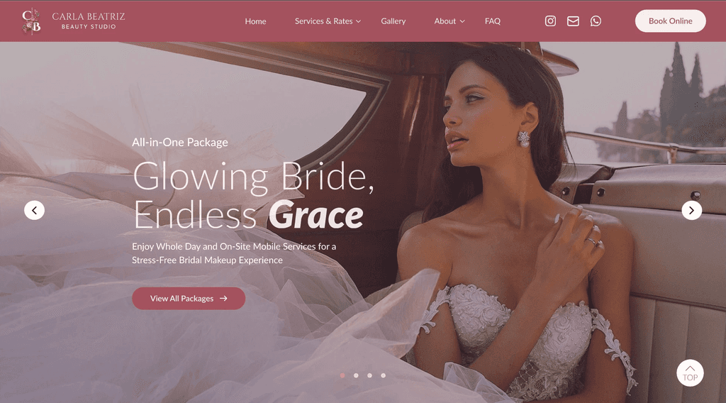
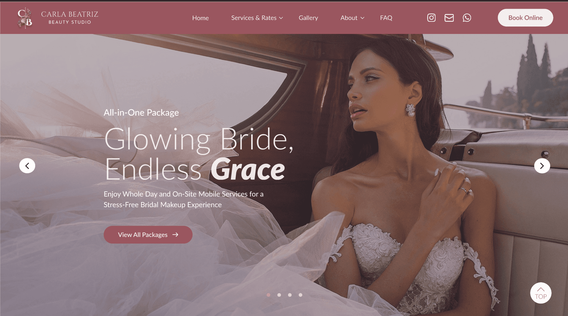
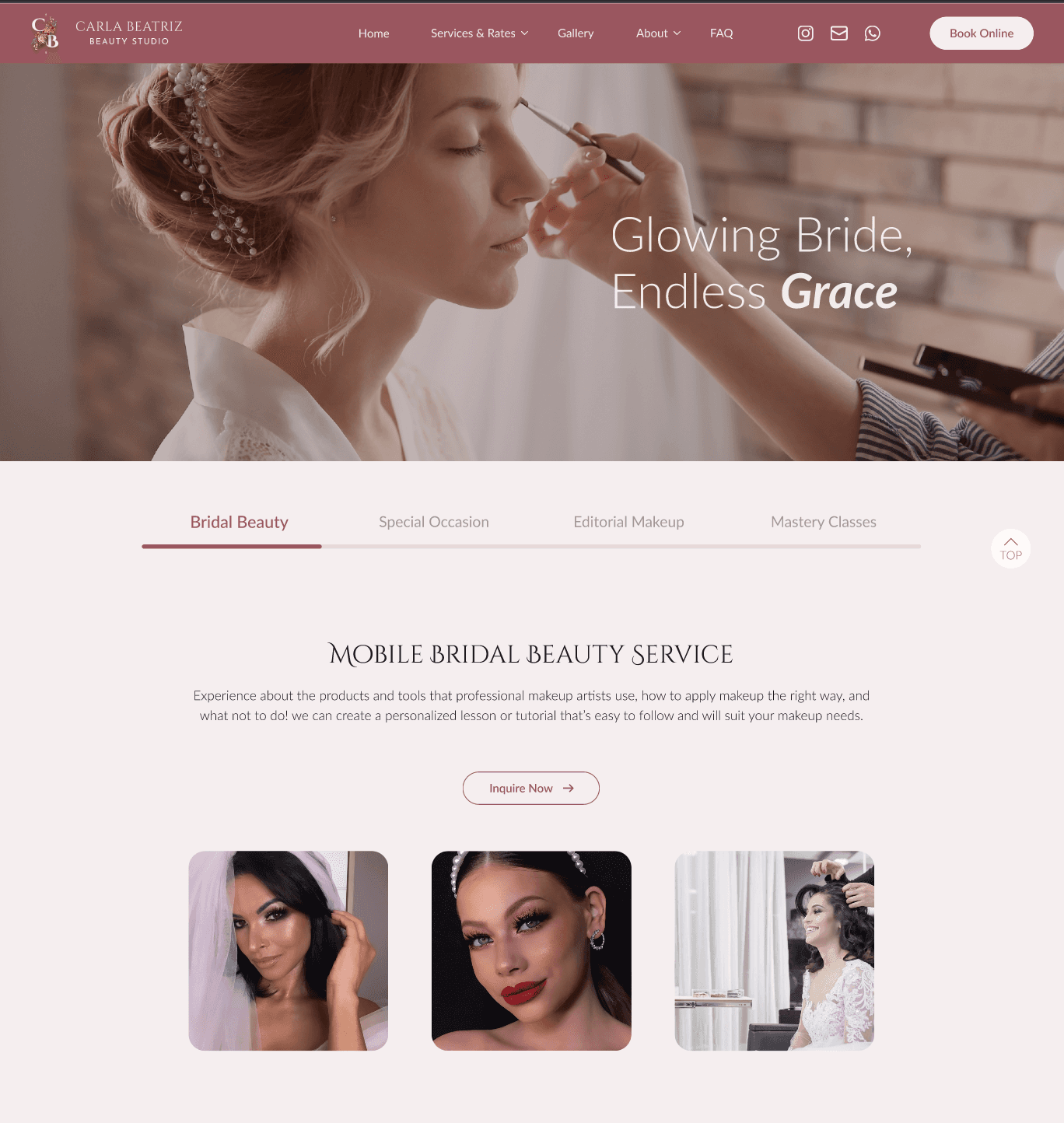
Updated Top Navigation Bar
Redesigned the navigation bar with larger, more readable text logos for improved visibility and user engagement.
Embedded a drop-down menu for seamless navigation and enhanced user experience, ensuring easy access to key sections of the site.
Visually Appealing Promotional Hero Section
Introduced a visually striking hero section that highlights featured products and services to captivate potential customers.
Designed with a focus on user interest, aiming to attract and retain customer attention from the moment they land on the page.
Strategic Call-to-Action (CTA)
Integrated a bold and clear CTA button to prompt users to take immediate action, such as booking services or exploring product offerings.
The CTA encourages visitors to engage with the website’s content right away, driving conversions and enhancing user interaction.
Simplified Navigation with Four Distinct Tabs
Divided the top navigation into four clear, well-labeled tabs for effortless user navigation, making it easy for visitors to find what they need quickly.
Clear Titles and Concise, Impactful Text
Emphasized clarity with straightforward titles and concise text, ensuring that users can easily understand the content without unnecessary distractions.
Interactive Hover Effects on Buttons
Added a subtle hover effect to buttons, providing visual feedback to users and signaling that the buttons are clickable, enhancing overall user interaction.
Avoided Confusing Shapes and Design Elements
Removed any ambiguous shapes or design elements that could confuse users or mislead them into thinking they are clickable, ensuring a smooth and intuitive browsing experience.
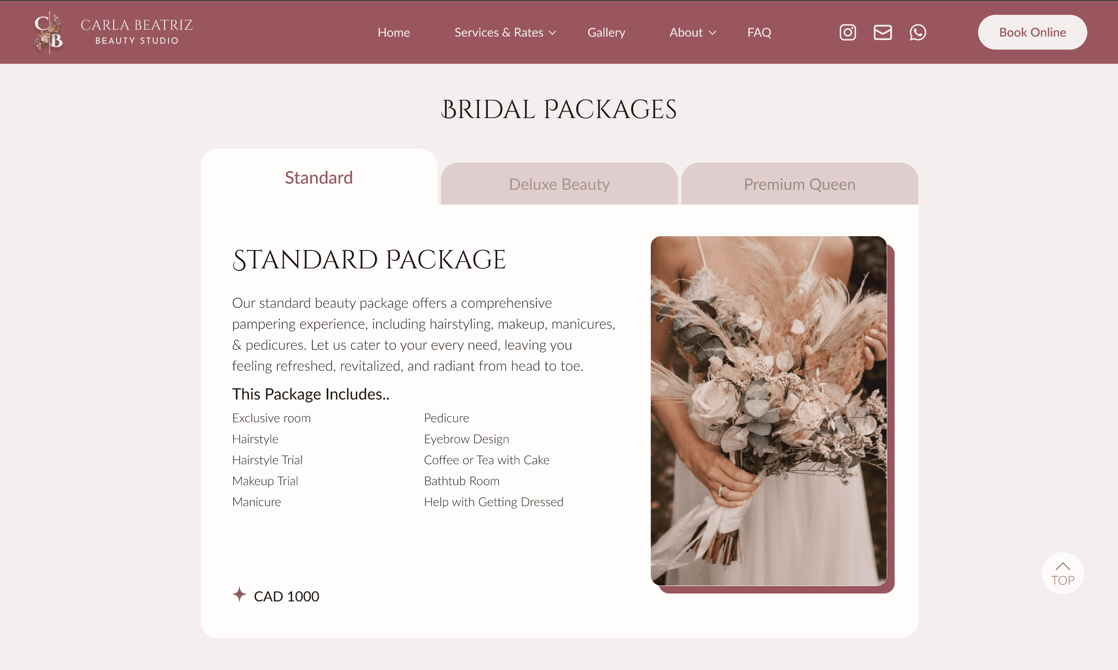
Distinctive Design for Active vs. Inactive Tabs
Applied a bold, visually distinct style to the active tab (e.g., highlighted color, underlining, or background contrast) to clearly indicate the user's current location on the site.
Inactive tabs were kept understated with lighter colors or simpler fonts, ensuring they don't distract from the active tab but remain visible and easy to navigate.
Strong Visual Hierarchy
Established a clear visual hierarchy by strategically sizing and styling elements based on their importance (e.g., larger, bold titles for primary content and smaller, subtler text for secondary information).
Important CTAs, headings, and featured content were given prominence through the use of color, contrast, and placement to guide the user’s attention and facilitate easy decision-making.
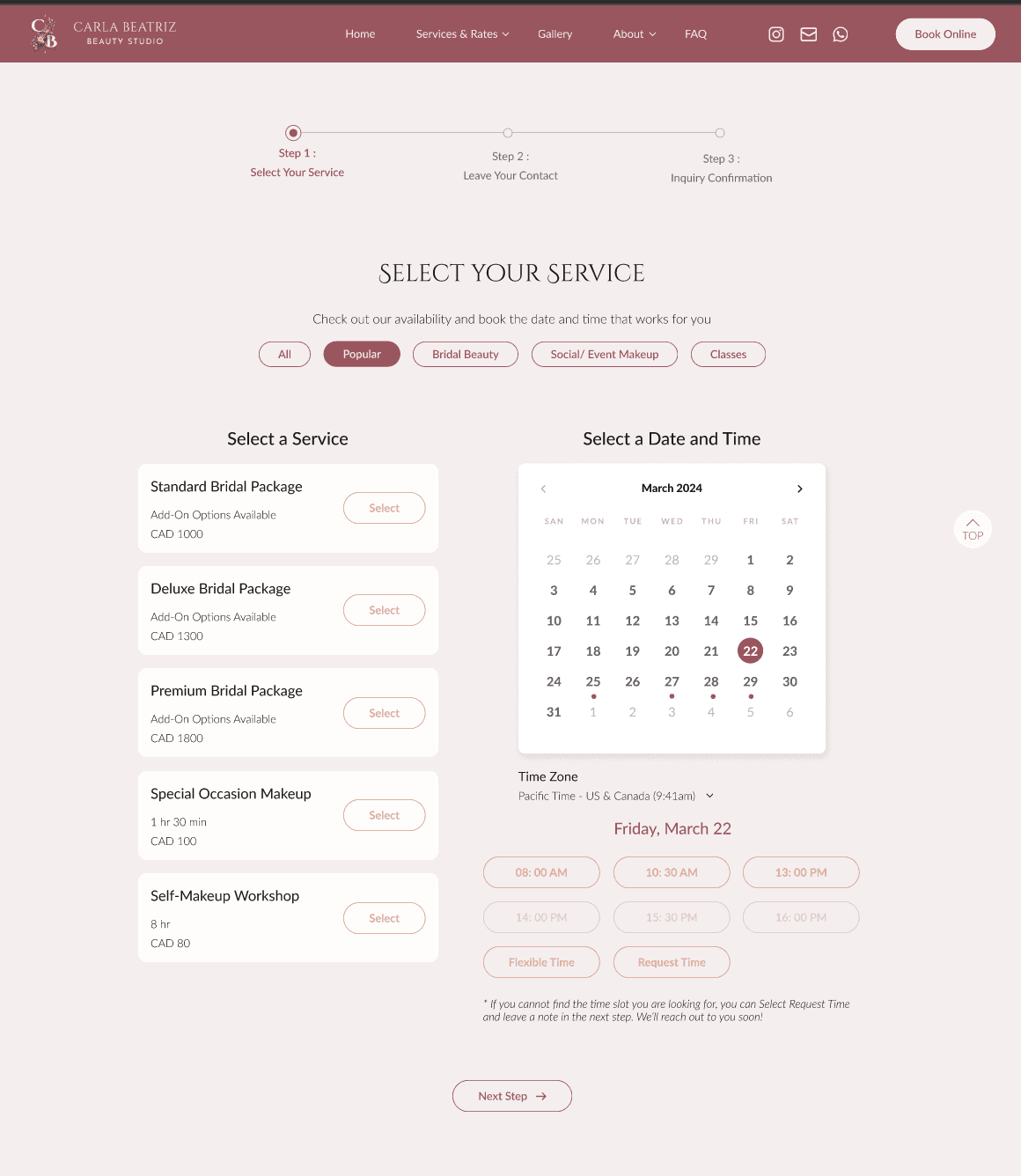
User Desire for Progress Tracking
Users appreciate seeing their progress during the booking process, which helps them feel in control and confident as they move through each step.
Creating a “Special” Experience
We recognized that users love to feel valued and unique, so we incorporated elements that make the booking experience more personalized and engaging.
Balancing Automation with Personalization
Automating the booking system presented a challenge, as Carla’s services are known for being “personalized,” “customizable,” and “luxury.” An entirely automated system risked losing that bespoke touch. The solution was to develop a balanced system that integrates personalized available quotations, ensuring that clients still receive a high-end, tailored experience while benefiting from the ease of online booking.
Conducted primary research, user interviews and competitor analysis
Turned research insights into viable design ideas
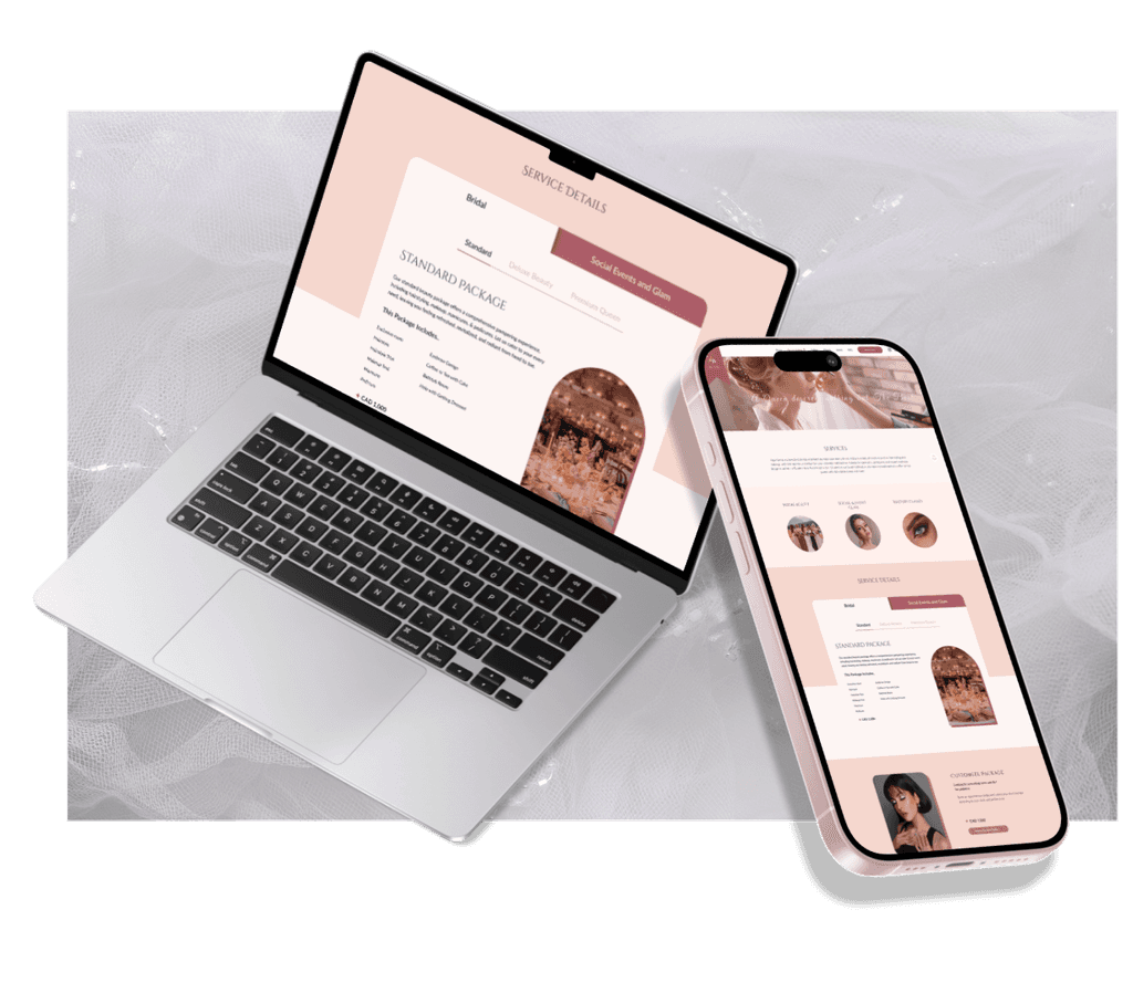
Designed the user interface and experience for the service and rate section of the website
Crafted high-fidelity user interfaces
Created interactive prototypes to bring the design to life
Bridging the Gap Between Perception and Reality
What we envision as ideal UI/UX often differs from what users actually need or expect. It’s crucial to recognize that our assumptions about design may not fully align with user behavior or preferences.
Collaborating with Real Clients for Valuable Feedback
To close this gap, working directly with real clients provides invaluable insights. By actively gathering feedback from user testing sessions, we ensure that our designs address actual user pain points and preferences, rather than relying solely on design theory or assumptions.
Prioritizing Key Features Based on User Feedback
Combining client feedback with results from user testing allows us to refine and prioritize the most essential features. This ensures that the design serves both business goals and user needs, creating a balanced, user-centered product.
Open Communication with Teams
Effective communication is essential when it comes to implementing design changes. By regularly discussing feedback from real users with our team, we ensure that everyone is aligned on which aspects of the design need adjustment, especially focusing on areas where users feel discomfort or confusion.
Aligning Design with User Expectations
Our goal is to design with purpose, ensuring that every change we make is in direct response to what both customers and real users need. This alignment helps us create intuitive, user-friendly experiences that resonate with the audience.
Understanding User Pain Points and Needs
A deep understanding of our target users’ primary needs and pain points is key to designing a successful product. By addressing these core issues, we can craft solutions that not only meet user expectations but also enhance overall satisfaction and usability.

